As your software and team grows, it becomes increasingly important to structure your code efficiently. You may already be familiar with design patterns and using frameworks to address some of these challenges.
Allow me to share some insights into how my team and I structure our components. Our foundation is a component-based framework. While we leverage Vue.js and Nuxt, similar approaches can be achieved with React or even Twig or Blade template languages. While I lack experience with other technologies beyond web frameworks, I can imagine that this approach could be applicable elsewhere.
At the end of our efforts, we aim to have a design system and component library.
These insights are based on my own experiences, and while you may find or use other solutions, they can be equally valid. In my opinion, there is no single correct way. Take what you find useful and discard the rest. 🤞
Let's dive in!
We employ:
- Atomic Design Pattern
- Component-based Framework (Vue.js)
- TailwindCSS (CSS Utility Framework)
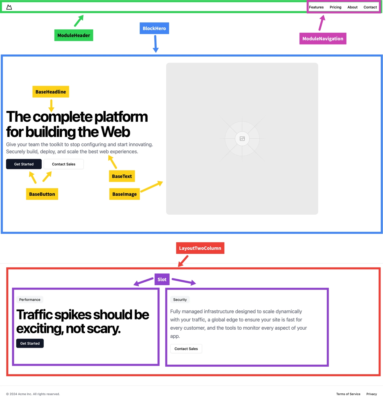
First and foremost, our foundation is the atomic design pattern introduced by Brad Frost. In summary, this pattern describes a structure of components from atoms (the smallest unit) to molecules and then organisms. To build a molecule, you combine some of your atom components, and so on.
However, we've expanded upon this pattern. Because the atomic design pattern is just a design pattern and does not cover all areas of web-based software, we've made adjustments and added additional rules to create a better fit and experience for our team.
Our components aren't named after chemical parts. We found it confusing to introduce another language into our already complex domains. Our smallest units are base components, which are essentially the same as atoms. Additionally, we have module components and section components. Just like in atomic design, our modules are built with base components, and sections are built with base and module components. The naming is inspired by the semantic HTML websites have, representing the way users recognize the parts of software.
Genererated by v0
In addition to the naming convention, there's a difference in terms of which part of data, state, and interaction the component owns. For example, base components only handle their own state. They won't have an API; instead, data is passed to the component only via props. The component will only emit events to communicate with the parent component. A base component cannot contain another base component. For instance, a button has local hover, focus, and clicked states but nothing that interacts with anything beyond itself.
// base button component

<template>
  <button @click="handleClick">
    {{ buttonText }}
  </button>
</template>

<script setup lang="ts">
import { defineProps, defineEmits } from "vue";

const props = defineProps({
  buttonText: String,
});

const { emit } = defineEmits();

const handleClick = () => {
  emit("click");
};
</script>

<!-- BaseButton.vue -->
Module components are the next level of components. They handle state and can be of any size; they can be placed anywhere within the software. Modules can fetch data and update the global state of the software. They also manage the contained base level components and their state.
// module component using button

<template>
  <div>
    <p>{{ moduleText }}</p>
    <BaseComponent buttonText="Click me" @click="handleClick" />
  </div>
</template>

<script setup lang="ts">
import BaseComponent from "./BaseComponent.vue";

const moduleText = "Module Component";

const handleClick = () => {
  console.log("Module Component clicked");
};
</script>

<!-- ModuleComponent.vue -->
With these two levels, we can already reuse components across the software, making it manageable and understandable for everyone else.
However, in certain scenarios, you need larger blocks to build software or provide them for use by non-developers, such as in a CMS. For such cases, we introduce sections or blocks. Just like sections in HTML semantics, sections will include base components and modules to create repeatable, reusable blocks, following the same rules as for modules.
// section component using a module or base component

<template>
  <section>
    <h2>{{ sectionTitle }}</h2>
    <ModuleComponent moduleText="Module Text" />
  </section>
</template>

<script setup lang="ts">
import ModuleComponent from "./ModuleComponent.vue";

const sectionTitle = "Section Title";
</script>

<!-- Section.vue -->
The top-level components may vary depending on the type of software being built. For websites, we use sections, but we also have layout components and page components.
Layout components only provide layouts, such as grids with slots. These slots can be used to place module or base components within the layout. This is something specific to Vue, but similar approaches likely exist in other systems.
// layout component with just slots

<template>
  <div>
    <h1>{{ pageTitle }}</h1>
    <LayoutComponent>
      <SectionComponent />
    </LayoutComponent>
  </div>
</template>

<script setup lang="ts">
import LayoutComponent from "./LayoutComponent.vue";
import SectionComponent from "./SectionComponent.vue";

const pageTitle = "Page Title";
</script>

<!-- Layout.vue -->
Page components are complete, reusable pages that apply in different locations of the software or website. A good example would be user profile pages, which could appear in the "my profile" area or when viewing a different person's profile.
// complete page component

<template>
  <div>
    <h1>{{ pageTitle }}</h1>
    <Layout>
      <slot></slot>
    </Layout>
  </div>
</template>

<script lang="ts">
import { defineComponent } from "vue";
import Layout from "./Layout.vue"; // Assuming this is the path to Layout

export default defineComponent({
  name: "Page",
  components: {
    Layout,
  },
  props: {
    pageTitle: String,
  },
});
</script>

<!-- Page.vue -->
In summary, the levels and how components could include each other are:
- Base
- Module
- Layout
- Section
- (Layout) ← additional layout levels could be used to organize multiple sections or modules in a page
- Page
Great!
However, there are some additional rules that apply to all components:
Every component can only have inner spacing, like padding, and should not introduce outer spacing like margin. Because the components are only responsible for their own level, it becomes difficult to use them independently across the software if they affect other levels with outer spacings. Lower-level components are composed in higher-level components, and the parent component will add spacing to the used child components. Additionally, when adding spacing, only top spacing (margin-top) should be used. This is because HTML elements of the same type (sections following after sections) will not add margins top and bottom. Moreover, if you attempt to style your components and adjust them in higher-level components, you'll be able to adjust the spacing using CSS effectively:
p {
  margin-top: 1rem;
}

h1 + p {
  margin-top: 2rem;
}
// You can only change the p not the h1 style if you want a different styling for p after h1

// ...

h1 {
  margin-bottom: 2rem;
}
// you have multiple h1 and want to change only h1 before p e.g. add space is not possible this way
Since CSS cascades, you can't change the style of the element before it but can adjust the element after it.
Choosing the right units is also crucial. rem values work well because every space adjusts automatically if people change their base font size on their device (for accessibility reasons), preventing design breakage. In addition to rem units, adopting an 8-point grid system may be beneficial.
An 8-point grid system consists of spacing where the lowest to the highest value is divisible by 2 (values like 5 or 10 won't fit this system, but 8, 6, and 12 will). The primary reason for adopting this system is to center content effectively. Due to sub-pixel rendering in browsers or systems, content that is 2.5 of something (e.g., pixels) may appear differently on various systems.
This pattern enables us to build frontends that are structured, reusable, and scalable across teams and software sizes. You don't need more than this to achieve these goals, but there are some handy tricks I'll share with you too.
Tailwind
Strictly speaking there is something even smaller than base components:
Design tokens
What are Design tokens?
Design tokens are the configuration parameters for the design system, giving the design its identity. Everything else can change, but the design's identity will remain consistent. Design tokens include colors, font sizes, font weights, font styles, spacings, borders, shadows, and more.
Essentially, Tailwind is based on these tokens, making it a great addition for creating your design system or component library.
Take a look at the tailwind.config.js file:
// example tailwind.config.js

module.exports = {
  mode: "jit",
  purge: ["./index.html", "./src/**/*.{vue,js,ts,jsx,tsx}"],
  darkMode: false, // or 'media' or 'class'
  theme: {
    extend: {
      colors: {
        primary: "#4a90e2",
        secondary: "#ff6347",
        accent: "#ffc107",
      },
      spacing: {
        0.5: "0.125rem",
        1.5: "0.375rem",
        2.5: "0.625rem",
        3.5: "0.875rem",
      },
      borderRadius: {
        xl: "1.5rem",
      },
      borderWidth: {
        3: "3px",
      },
      fontSize: {
        xl: "1.5rem",
        "2xl": "2rem",
      },
      fontFamily: {
        body: ["Roboto", "sans-serif"],
      },
    },
  },
  variants: {
    extend: {},
  },
  plugins: [],
};
You can adjust all the settings you see here: these are the tokens. These tokens are also available in Figma or other design software. While there are automated export solutions to extract tokens from design software, I lack experience with them. Nonetheless, we use Tailwind and always a custom config to create our own design system, which perfectly fits into our workflow.